Help
- Adding, Clearing and Refreshing Cards
- Choosing Content and Setting the Page Font Size
- Full Screen and Solo View
- Individual Card Buttons and Settings
- Saving and Sharing the Page
Prompt Cards
5 Minute MFL displays Prompt Cards, either in a grid or one by one. Each card shows a prompt that could be, for example, a question, a discussion starter, or a more open language production stem.
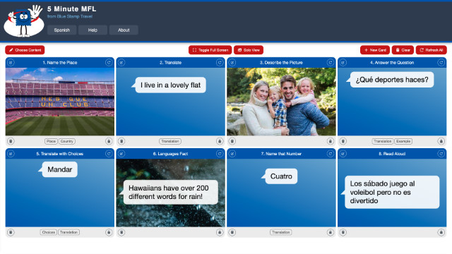
At the bottom of a card, there might one or two buttons that toggle the display of answers, hints or possible responses. If the card is a simple prompt or image that requires no interaction, then there will be no button at the bottom. The following card has a single 'Translation' button that shows and hides the translation text.
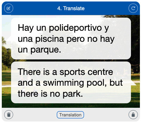
This Help page describes the ways in which cards and pages can be configured to fit more specific targets for a lesson or homework. Once configured, page URLs can be bookmarked or shared, so pupils or other teachers can visit the tailored page at any point in the future.
Adding, Clearing and Refreshing Cards
These three buttons, at the top right of the card grid on wider screens, are for managing cards in the grid.

- New Card: Add a new card to the end of the grid, starting a new row if necessary.
- Clear: Clear the grid, removing all cards.
- Refresh: Refresh all of the cards (where the card is not locked).
Choosing Content and Setting the Page Font Size
These three buttons, at the top left of the card grid on wider screens, are for choosing the content of the cards on the page and for setting the default font size for text on the cards.

- Choose Content: Enter the page content chooser view (see below).
- Small A: Decrease the font size in steps down to the minimum size.
- Big A: Increase the font size in steps up to the maximum size.
The content chooser view lets you select up to two filters that determine the content shown on the cards. You can choose content that matches course sections or topics.
The image below shows content chooser settings that will display cards whose content matches section 2 of the Viva 1 textbook's Mi ciudad chapter, and are on the topic of Places.
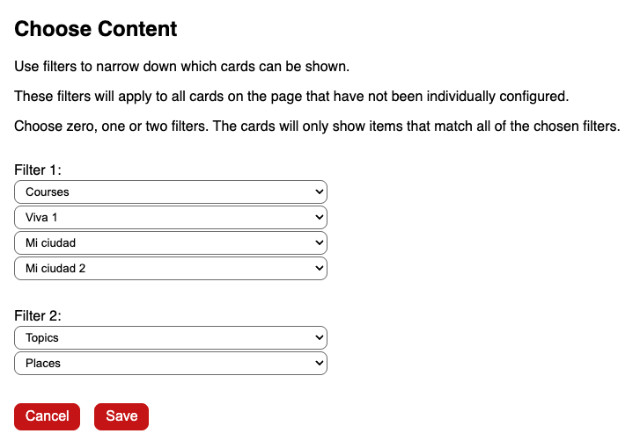
The filters set in the content chooser will apply to all cards on the page apart from the cards you have individually configured.
Full Screen and Solo View
These two buttons allow you to change how the cards are displayed.

- Full Screen: Hide the header bar and make the browser window fill the screen.
- Solo View: Display cards one at a time.
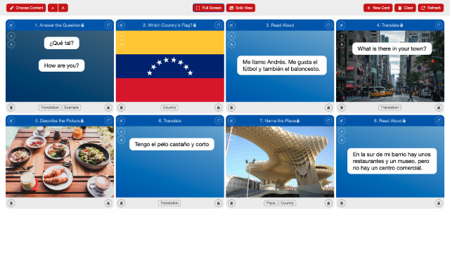
The image below shows the app in full screen mode, with the header bar hidden. The control buttons are still shown above the card grid.
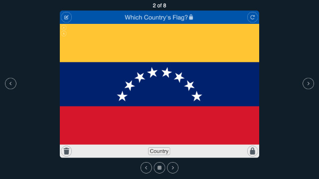
The image below shows the app in Solo View, displaying a single card, with navigation buttons for moving through the set of cards one by one.
Individual Card Buttons and Settings
There is an icon button in each of the four corners of each card. Starting at the top left and moving clockwise around the card, the button actions are Edit, Refresh, Lock and Remove.
- Edit Card: Enter card configuration view (see below).
- Refresh: Load new content for this card.
- Lock: Cycle through card type locked, card locked or unlocked states.
- Remove: Remove this card from the grid.
Edit Card
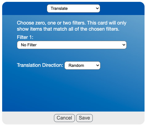
In the card editor, you can choose which card type and content the card will show. Choices here take precedence over choices made at the page level. Some card types let you choose the direction of any translations: random, from English or to English.
Lock States
Cards can be unlocked, type locked or card locked, as listed below:
- Unlocked: Refreshing the card or page will load a new card of any type.
- Type Locked: Refreshing the card or page will load a new card of the same type. A small lock icon appears at the end of the card type in the card header.
- Card Locked: Refreshing the page will load the exact same card again. As well as a lock icon after the card type in the card header, the refresh button icon also becomes a lock.
Saving and Sharing the Page
Any changes you make to the page content and configuration are stored in the page's URL in the address bar at the top of the page. If you copy the URL, you can add it to a scheme of work or send it to a colleague, for example.
https://www.5minutemfl.com/spanish?cards=22-0-0f4-1&tags=125
You don't need to know what the parts of the URL mean, just that you can bookmark the page to return to later.